Unearthing the Visual Splendor: A Deep Dive into Atlantis: The Lost Empire Character Design
Disney’s Atlantis: The Lost Empire, released in 2001, remains a fascinating, albeit somewhat underappreciated, entry in the studio’s animated canon. Beyond its compelling narrative and blend of science fiction and adventure, the film boasts a unique and captivating visual style, particularly evident in its character design. This article will delve into the meticulous process, influences, and artistic choices that shaped the memorable characters of Atlantis, exploring why their design continues to resonate with audiences today. The character design of Atlantis: The Lost Empire distinguishes it from other Disney animated features.
The Influence of Mike Mignola and Hellboy
One of the most significant aspects of Atlantis‘s character design is the direct influence of comic book artist Mike Mignola, creator of Hellboy. Disney actively sought Mignola’s input to break away from the traditional Disney aesthetic and create a more stylized and angular look. Mignola served as a production designer, contributing significantly to the overall visual direction of the film, including the character design. His distinctive style, characterized by strong silhouettes, bold lines, and simplified shapes, is readily apparent in the characters’ appearances. This deliberate departure from the rounded, softer forms typically associated with Disney animation gave Atlantis a distinct and mature feel.
Mignola’s influence is particularly noticeable in the characters’ faces and body proportions. Many characters feature strong jaws, pronounced noses, and generally more angular features than those seen in other Disney films. This stylistic choice not only made the characters visually striking but also contributed to the film’s overall sense of adventure and danger. The Atlantis character design consciously steered away from the traditional Disney character design.
Breaking from Tradition: A Stylized Approach
The decision to embrace a more stylized approach to character design was a deliberate attempt to differentiate Atlantis from other animated films. Disney wanted to create a film that felt unique and visually distinct, and the angular, Mignola-inspired character design was a key component of this strategy. This departure from tradition was not without its challenges, as it required the animation team to adapt to a different way of drawing and animating characters. However, the effort paid off in creating a visually stunning film that stands apart from other Disney productions. The unique character design of Atlantis set it apart.
The emphasis on silhouettes and strong lines also played a crucial role in the film’s visual storytelling. The animators used these elements to create dynamic and expressive characters that were easy to read and understand, even in complex action sequences. The characters’ designs were carefully considered to ensure that they conveyed their personalities and motivations effectively. [See also: The Art of Visual Storytelling in Animation]
Character Spotlights: Design and Personality
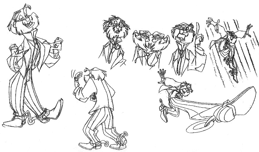
Milo Thatch: The Eager Linguist
Milo Thatch, the film’s protagonist, embodies the spirit of adventure and intellectual curiosity. His character design reflects his personality as a bookish and somewhat awkward linguist. He is drawn with a slightly lanky frame, large glasses, and a generally unkempt appearance, all of which contribute to his endearing awkwardness. His design emphasizes his intelligence and passion for history, making him a relatable and sympathetic character. The Atlantis character design made Milo instantly recognizable.
Milo’s clothing, consisting of a simple shirt, pants, and vest, further reinforces his unassuming nature. His design contrasts sharply with the more rugged and experienced members of the expedition, highlighting his naiveté and inexperience. However, as the film progresses, Milo’s character design evolves to reflect his growing confidence and leadership abilities. [See also: The Evolution of Character Design in Animation]
Audrey Ramirez: The Resourceful Mechanic
Audrey Ramirez, the team’s skilled mechanic, is a strong and independent woman who defies traditional gender roles. Her character design reflects her tough and capable nature. She is drawn with a muscular build, short hair, and a determined expression. Her clothing, consisting of overalls and a bandana, further emphasizes her practical and no-nonsense attitude. The Atlantis character design gave Audrey a strong presence.
Audrey’s design is a refreshing departure from the stereotypical portrayal of female characters in animation. She is not defined by her beauty or her romantic interests but by her skills and her determination. Her character design is a testament to the film’s progressive and empowering message. [See also: Strong Female Characters in Animation]
Commander Rourke: The Ruthless Leader
Commander Rourke, the film’s primary antagonist, is a cold and calculating leader whose ambition knows no bounds. His character design reflects his ruthless and authoritarian nature. He is drawn with a stern expression, a commanding presence, and a military uniform that emphasizes his power and authority. The Atlantis character design made Rourke an intimidating villain.
Rourke’s design is a stark contrast to Milo’s more unassuming appearance. He is portrayed as a physically imposing figure who exudes confidence and control. His design is intended to convey his ruthlessness and his willingness to do whatever it takes to achieve his goals. [See also: The Art of Designing Villains]
Princess Kida: The Ancient Protector
Princess Kida, the Atlantean princess, is a strong and independent leader who is fiercely protective of her people and her culture. Her character design reflects her regal status and her connection to the ancient city of Atlantis. She is drawn with a slender frame, long white hair, and striking blue markings that adorn her body. Her clothing, consisting of simple yet elegant garments, further emphasizes her connection to her heritage. The Atlantis character design made Kida a memorable princess.
Kida’s design is both beautiful and powerful, reflecting her role as both a princess and a warrior. Her blue markings, which are a symbol of her connection to the Heart of Atlantis, add a unique and mystical element to her appearance. Her character design is a testament to the film’s commitment to creating strong and complex female characters. [See also: Cultural Influences in Character Design]
The Use of Color and Lighting
In addition to the characters’ physical designs, the use of color and lighting also played a crucial role in shaping their appearances and conveying their personalities. The animators used a limited color palette, consisting primarily of blues, greens, and browns, to create a sense of mystery and adventure. They also used dramatic lighting to highlight the characters’ features and create a sense of depth and dimension. The color palette used for Atlantis character design was carefully selected.
For example, Milo is often depicted in warm, inviting colors, reflecting his optimistic and enthusiastic nature. Rourke, on the other hand, is often depicted in cool, imposing colors, emphasizing his cold and calculating personality. The use of color and lighting is just one of the many ways in which the animators used visual cues to enhance the film’s storytelling. [See also: The Psychology of Color in Animation]
Legacy and Influence
Despite its initial mixed reception, Atlantis: The Lost Empire has garnered a dedicated following over the years, thanks in no small part to its unique and captivating character design. The film’s influence can be seen in other animated productions that have embraced a more stylized and angular aesthetic. The Atlantis character design continues to inspire artists and animators today.
The film’s character design is a testament to the power of collaboration and the importance of taking risks. By embracing a different visual style, Disney was able to create a film that stands apart from other animated productions. The characters of Atlantis are not only visually striking but also deeply engaging, thanks to the meticulous attention to detail that went into their design. The lasting impact of Atlantis character design is undeniable.
The Atlantis character design is a prime example of how animation can be used to tell compelling stories and create memorable characters. The film’s visual style is a unique and captivating blend of science fiction and adventure, and its characters are brought to life through meticulous attention to detail and a willingness to break from tradition. As a result, Atlantis: The Lost Empire remains a beloved and influential film that continues to inspire audiences around the world. The unique Atlantis character design made the film stand out. The detailed Atlantis character design is still admired today.
Conclusion
The character design of Atlantis: The Lost Empire is a masterclass in visual storytelling. By embracing a stylized aesthetic influenced by Mike Mignola, Disney created a film that is both visually striking and emotionally engaging. The characters’ designs are carefully considered to convey their personalities and motivations effectively, and the use of color and lighting further enhances the film’s storytelling. Atlantis character design remains a significant achievement in animation history, influencing subsequent works and captivating audiences with its unique visual style. The film’s legacy continues to grow as new generations discover its unique charm and appreciate the artistry that went into creating its memorable characters. The Atlantis character design is a testament to the power of creativity and innovation in animation.
