Centering Your Image: A Comprehensive Guide to Perfect Alignment
In the world of web design and digital content creation, visual appeal is paramount. One crucial element that contributes significantly to a polished and professional look is proper image alignment. Specifically, ensuring that your image should be centered within its parent container is a fundamental skill that every web developer, designer, and content creator should master. This article delves into the various methods and techniques for achieving perfect image centering, covering both CSS and HTML approaches, along with considerations for responsive design and accessibility.
Understanding the Basics of Image Centering
Before diving into the technical details, let’s clarify what it means to center an image. Centering an image typically refers to aligning it both horizontally and vertically within its containing element. The “parent” element, in this context, is the HTML element that directly contains the image tag. The goal is to make the image appear balanced and visually harmonious within its designated space. Ensuring your image should be centered within its parent makes your website more visually appealing.
Why is Image Centering Important?
- Aesthetics: Well-aligned images contribute to a cleaner and more professional design.
- User Experience: Properly centered images guide the user’s eye and improve the overall browsing experience.
- Responsiveness: Centering images ensures they adapt well to different screen sizes and devices.
- Accessibility: Consistent image alignment can improve accessibility for users with visual impairments.
CSS Techniques for Centering Images
CSS (Cascading Style Sheets) provides several powerful methods for centering images. Let’s explore some of the most common and effective techniques.
Using `text-align: center`
The simplest method for horizontally centering an inline or inline-block image is to apply `text-align: center` to the parent element. This works because, by default, images are treated as inline elements, similar to text.
<div style="text-align: center;">
  <img src="image.jpg" alt="Centered Image">
</div>
This approach is straightforward and widely supported, making it a reliable choice for basic image centering. If your image should be centered within its parent and the parent is a block-level element, this is a great option.
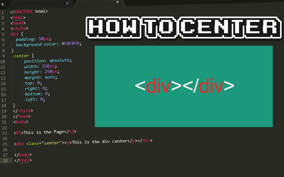
Using Margin Auto
Another common technique involves setting the left and right margins of the image to `auto`. This method works when the image has a defined width that is less than the width of its parent container. To use this method, the image must be a block-level element.
<img src="image.jpg" alt="Centered Image" style="display: block; margin-left: auto; margin-right: auto; width: 50%;">
Here, `display: block` ensures the image behaves as a block-level element, and `margin-left: auto; margin-right: auto;` centers it horizontally. The `width: 50%;` sets the image width to 50% of its parent container, ensuring it’s smaller than the parent and can be centered. This method ensures your image should be centered within its parent horizontally.
Using Flexbox
Flexbox is a powerful CSS layout module that provides a flexible and efficient way to align items within a container. To center an image using Flexbox, you need to set the parent element’s `display` property to `flex` and then use the `justify-content` and `align-items` properties to control horizontal and vertical alignment, respectively.
<div style="display: flex; justify-content: center; align-items: center; height: 200px;">
  <img src="image.jpg" alt="Centered Image">
</div>
In this example, `justify-content: center;` centers the image horizontally, and `align-items: center;` centers it vertically. The `height: 200px;` is added to define the height of the parent container, allowing for vertical centering. Flexbox is a robust solution to ensure your image should be centered within its parent, both horizontally and vertically.
Using Grid Layout
CSS Grid Layout is another powerful layout module that offers precise control over the positioning of elements. Similar to Flexbox, you can use Grid to easily center images both horizontally and vertically.
<div style="display: grid; place-items: center; height: 200px;">
  <img src="image.jpg" alt="Centered Image">
</div>
Here, `display: grid;` enables Grid Layout for the parent container, and `place-items: center;` is a shorthand property that sets both `align-items` and `justify-content` to `center`, effectively centering the image both horizontally and vertically. Like Flexbox, a defined height is needed for vertical centering. Using Grid ensures your image should be centered within its parent with ease.
Using Absolute Positioning and Transforms
This method is more complex but can be useful in certain situations, especially when dealing with images of unknown dimensions or when you need to center an image within a specific area of a larger container. It involves setting the parent element to `position: relative;` and the image to `position: absolute;`, then using the `transform` property to shift the image into the center.
<div style="position: relative; height: 200px;">
  <img src="image.jpg" alt="Centered Image" style="position: absolute; top: 50%; left: 50%; transform: translate(-50%, -50%);">
</div>
In this example, `position: relative;` on the parent allows the absolute positioning of the image within it. `position: absolute; top: 50%; left: 50%;` positions the top-left corner of the image at the center of the parent. Finally, `transform: translate(-50%, -50%);` shifts the image back by half its width and height, effectively centering it. This method is highly effective to make sure your image should be centered within its parent.
Considerations for Responsive Design
In today’s mobile-first world, it’s crucial to ensure that your image centering techniques work well across different screen sizes and devices. Responsive design involves adapting your website’s layout and content to provide an optimal viewing experience on any device.
Using Media Queries
Media queries allow you to apply different CSS styles based on the characteristics of the device, such as screen width, height, and orientation. You can use media queries to adjust the image centering techniques for different screen sizes.
/* Default styles */
img {
  display: block;
  margin-left: auto;
  margin-right: auto;
  width: 50%;
}

/* Media query for smaller screens */
@media (max-width: 768px) {
  img {
    width: 80%; /* Adjust width for smaller screens */
  }
}
In this example, the default styles center the image using `margin: auto;` and set its width to 50%. The media query then adjusts the width to 80% for screens smaller than 768 pixels. Ensuring your image should be centered within its parent responsively is critical for user experience.
Using Flexible Units
Instead of using fixed units like pixels (px), consider using flexible units like percentages (%) or viewport units (vw, vh) for image widths and heights. This allows the images to scale proportionally with the screen size.
img {
  width: 100%; /* Image takes up 100% of its parent's width */
  height: auto; /* Height adjusts proportionally */
}
Using `width: 100%;` ensures that the image always fills the width of its parent container, while `height: auto;` maintains its aspect ratio. This ensures your image should be centered within its parent and adapts to different screen sizes.
Accessibility Considerations
Accessibility is an essential aspect of web design that ensures your website is usable by people with disabilities. When centering images, it’s important to consider how your techniques might affect accessibility.
Providing Alternative Text
Always provide meaningful alternative text (alt text) for your images. Alt text describes the content of the image to users who cannot see it, such as those using screen readers.
<img src="image.jpg" alt="Description of the image">
Ensure that the alt text accurately describes the image and provides context for its purpose. This helps users understand the content even if they cannot see the image. This supports the goal that your image should be centered within its parent and be accessible.
Using ARIA Attributes
ARIA (Accessible Rich Internet Applications) attributes can be used to provide additional information about the role and state of elements on your page. While centering images doesn’t typically require ARIA attributes, you might use them in conjunction with other elements to improve accessibility.
Common Mistakes to Avoid
When centering images, it’s easy to make mistakes that can lead to unexpected results. Here are some common pitfalls to avoid:
- Forgetting to define the parent element: Ensure that the parent element has a defined width and height, especially when using absolute positioning or Flexbox.
- Using incorrect CSS properties: Double-check that you’re using the correct CSS properties for the desired centering effect. For example, `text-align: center;` only works for inline or inline-block elements.
- Ignoring responsive design: Test your image centering techniques on different devices and screen sizes to ensure they work well across the board.
- Neglecting accessibility: Always provide alt text for your images and consider how your centering techniques might affect users with disabilities.
Conclusion
Centering images is a fundamental skill in web design and digital content creation. By mastering the various CSS techniques discussed in this article, you can ensure that your image should be centered within its parent container, contributing to a more visually appealing and user-friendly website. Whether you choose to use `text-align: center`, `margin: auto`, Flexbox, Grid, or absolute positioning, the key is to understand the strengths and limitations of each method and choose the one that best suits your specific needs. Remember to consider responsive design and accessibility to create a truly inclusive and engaging online experience. By ensuring your image should be centered within its parent, you enhance the overall aesthetic and usability of your web content. [See also: Responsive Image Techniques] [See also: CSS Layout Best Practices]
